TransOpen UI
Magic Cap-inspired UI
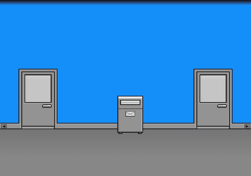
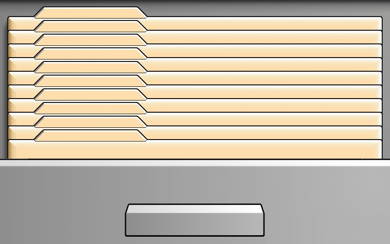
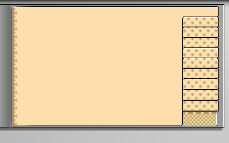
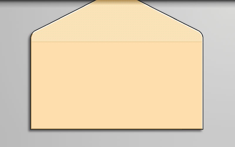
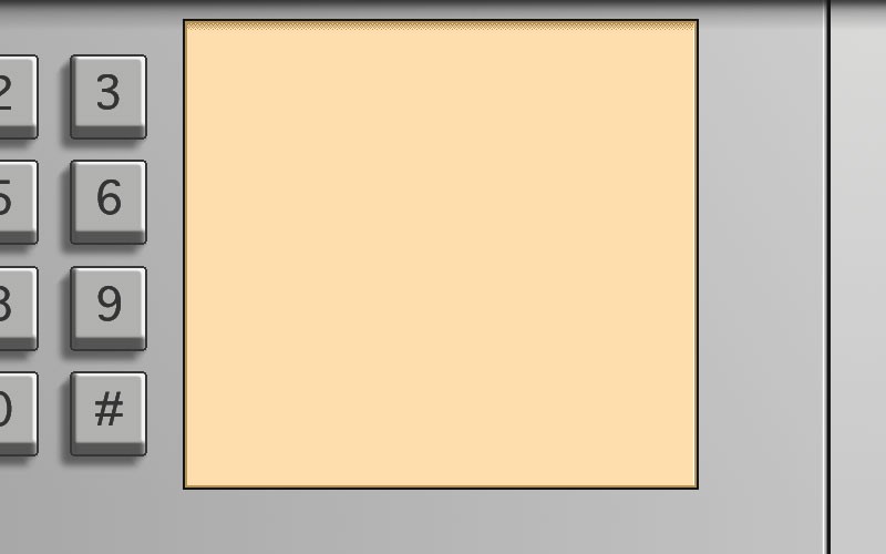
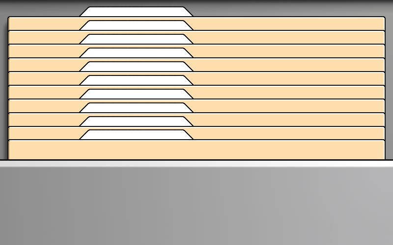
TransOpen, a promising startup, was in the midst of developing innovative online communication software. They were searching for a unique UI design that would perfectly reflect their vision. In collaboration with their design agency, Spring Communication, they went through numerous iterations, yet none met their specific desires. Inspired by Magic Cap, TransOpen aimed for a similar look but with their own twist. The challenge was to create an impressive design that would perform optimally with only 16 colors. When none of the proposed designs met their high standards, they turned to us—ready to bring their vision to life!
THE ASSIGNMENT
My task was to create simple, pixel-like UI graphic elements for TransOpen. After several exploratory phases, the company was convinced that we had found the right direction and that I would be able to design all the necessary screens. This project marked my debut as a professional interaction designer, a milestone I achieved during my student years. I dedicated my summer vacation to honing these designs, which proved to be not only a valuable learning experience but also laid the foundation for my future career in the design world.
OUR ROLE
— Pixel art UI design
PROJECT DETAILS
TIMELINE
— Approx. 4 weeks, incl. revisions
DELIVERABLES
— 15 pixelated UI illustrations


